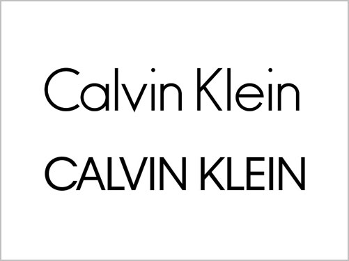
We grew up with Calvin Klein jeans. And with Brooke Shields as a sparsely-dressed example, we proudly displayed the name on our derrieres offering free advertising to the passers-by. In the 70s, Calvin Klein replaced the popular Levi’s brand and ushered in the beginning of designer desire for teenagers everywhere. Everyone needed a pair of Calvin Klein jeans, as they guaranteed instant status by way of the easily-recognizable label. The original Calvin Klein logo was one of the most successful apparel labels in history. So why would they rebrand? Was it because of a new art director who couldn’t leave well-enough alone? Like good movies, some logos shouldn’t be remade.
The original logo was based on Futura, a very open-faced, sans-serif font. Part of the beauty of the wordmark was the sublime design of the typeface itself, coupled with the subtle spacing of the mostly-small-case letters. The redesign features heavier type and same-height, all-cap letters, crowded into a generic wad of text with none of the attention to positive and negative forms required for good design. While Calvin Klein posted on Instagram that it was a “return to the spirit of the original,” the redesign suggests that the designer had no appreciation for or understanding of what was truly remarkable about the logo.
Unfortunately, this rebranding ruined one of the greatest fashion logos in history.


You must be logged in to post a comment.