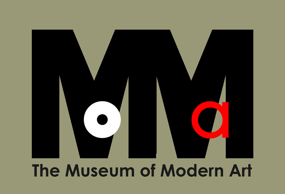
Going through some old digital files and found these. Love the Museum of Modern Art–hate the logo. The results of some playing around. Not sure about the “Ground Zero” one, although there’s something dangerous about cropping a thing at its edge–at least in an artist’s mind. I can think of more dangerous things actually…


MOMA’s current typeface is inspired by Franklin Gothic. The original logo was, in fact, Franklin Gothic. You’ll find lots of MOMA graphics and logo designs online, some of them more interesting than mine, if you do a search for “MOMA” and “logo design.”


You must be logged in to post a comment.