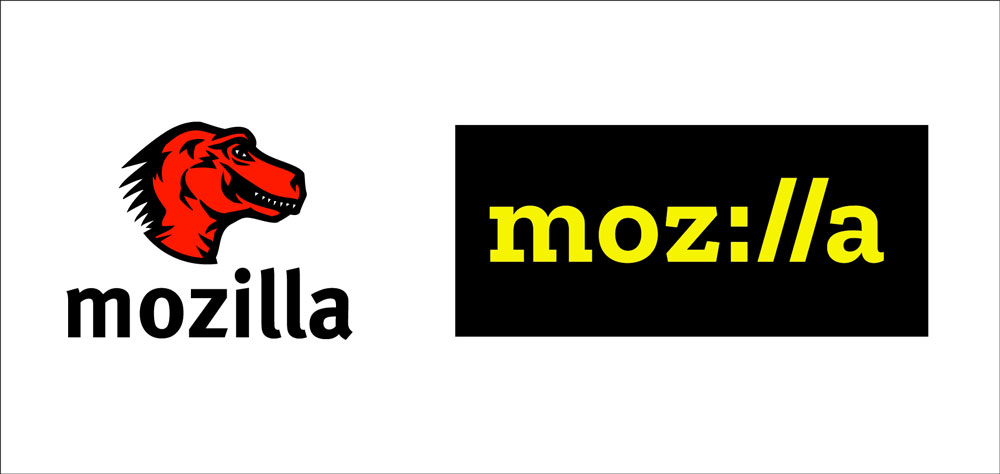
Ditch the Dinosaur and Embrace Technology–Mozilla Couples Genius Marketing with Smack-On Design for Tremendous Rebranding Success Mozilla’s much-publicized redesign produced a sorely-needed update to their tired T. Rex-style logo. The original design aligned closely with the company name while capitalizing on the popularity of dinosaurs in the 90s (it actually resembled the Jurassic Park logo–right…


You must be logged in to post a comment.