Laurie Halbritter Blog

Laurie Halbritter WordPress Blog Thought Tank

  • Home
  • What
  • Words
    • Culture
    • Curiosities
    • Design
    • Lifestyle
    • Poems
    • Reviews
    • Technology
  • Ideas
  • Visuals
    • Visuals
      • Typography Plus
      • Photography
  • Connect

Company Logo Design – Brand-Building Fundamentals

02.13.2019 by Person //

Company Logo Design – Brand-Building Fundamentals

graphic designer logo drawingA well-designed company logo is essential to your brand recognition—what differentiates you from the competition. Good logo design has three main qualities: it’s instantly recognizable, it endures the test of time, and it graphically and aptly conveys your company message in a simple pictographic. Would a Coke still taste like a Coke without those instantly identifiable, nostalgic, undulant characters in the logo? Well, maybe, but without the logo, we might miss it altogether when perusing the cooler shelf at the 7-11.

A good company logo design distills your company’s identity into a powerful, expressive graphic. Logo development is a process, an art, and a skill, honed through practice and dedication (which is why you might want to hire a pro). Design also entails something else that’s somewhat elusive: a gift or special talent. Investing in a finely-tuned logo is never something a business should take lightly as it is so fundamental to brand building. So before you move forward in choosing and developing your company logo, consider the hallmarks of an effective logo design and take some time to develop a strong, recognizable graphic identity that makes a lasting impression on your customers.

Categories // Design Tags // brand, company brand, design, graphic design, graphics, logo

Mozilla Logo Redesign

12.01.2017 by Person //

Mozilla Logo Redesign

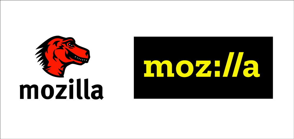
Mozilla Logo Comparison

Ditch the Dinosaur and Embrace Technology–Mozilla Couples Genius Marketing with Smack-On Design for Tremendous Rebranding Success

Mozilla’s much-publicized redesign produced a sorely-needed update to their tired T. Rex-style logo. The original design aligned closely with the company name while capitalizing on the popularity of dinosaurs in the 90s (it actually resembled the Jurassic Park logo–right down to the color choices). While an argument might be made for preserving the love of extinct creatures, the name itself did not really convey what Mozilla does, so it made sense to ditch the dinosaur from the redesign and create a new graphic identity that better embodies the company’s function, which is developing products for the internet.

Aside from the content (namely, dinosaurs), the original logo came across as a boring, lackluster illustration with some non-complementary text appended. The new wordmark, by Johnson Banks, totally nails the tech and internet focus of the brand by incorporating a URL into the logo, with “l’s” represented by forward slashes and the “i” standing in for the colon. The logo got its own complementary slab-serif-style font (Zilla by Typotheque) that harkens to Courier (a typewriter-style coding font).

Unlike most logos with dedicated or single-branded color schemes, the new Mozilla logo is designed to display in a variety of primary and secondary colors—whatever seems appropriate to the context. The radical redesign, along with their flashy, high-profile roll-out, made for a very successful rebranding.

Mozilla Colored Logos

Categories // Design, Reviews Tags // design, logo, logo design, mozilla logo redesign, rebranding, typography

Categories

Copyright © 2023 · Modern Studio Pro Theme on Genesis Framework · WordPress · Log in