THE DEMOCRATIZING OF DESIGN IN A DIGITAL CULTURE
Xerography. Grunge type. Collage. Hand-drawn lettering. Graffiti. Street design. The death of the grid. Illegibility. David Carson. The end of print.
Something happened to design. It happened quickly, before we could do anything about it. Where were we when the transformation took place? In symbiosis with MTV. Sucked into the vacuum of the web. Sitting on a subway, dazzled by the noise, the overwhelming montage of images, of ads and words. The words are numbing in their ubiquity and have begun to emerge as abstract, prepictogrammic characters. The train surges ahead and the words, detached from their context, become disassociated from their meaning. And what remains is a vortex of colors, sounds, lights, disjointed images, and scattered, graphic type. But what about readability? What about meaning? And just what is it that’s being communicated, and to whom?
These are some of the issues facing contemporary design and culture. And, just as there are plenty of disjointed, scattered images floating about, there are just as many divergent opinions about the whole phenomenon.
Escape From the Grid
Designer David Carson, a “post-modern” typographer and enfant terrible, has won national acclaim with his magazines Beach Culture and Ray Gun. Also to his credit are numerous corporate ad campaigns (Microsoft, Packard Bell, Giorgio Armani). The designs are largely freeform, rejecting the conventional organizational structure of the grid. Carson’s images utilize traditionally incompatible typefaces, abrupt and eccentric cropping of images and text, and other visually disruptive techniques.

This liberation from the grid is certainly not a new concept. As early as the 1920’s typography guru Jan Tschichold was experimenting with these techniques. The Bauhaus design group with which Tschichold was affiliated were advocates of the free play of letters and images. Also in the 1920s, Moholy-Nagy, an instructor at the Bauhaus, advocated an uninhibited use of all linear directions (therefore not only horizontal articulation). In effect, he said, we use all typefaces, type sizes, geometric forms, colors, etc. We want to create a new language of typography whose elasticity, variability, and freshness of typographical composition [are] exclusively dictated by the inner law of expression and optical effect (Meggs 191).
Despite these precedents, Carson has been savaged as illegible, radical, and irreverent on one side, and hailed as a genius on the other. But no one can deny his profound impact on contemporary design. And what, exactly, separates Carson from earlier designers? Mass media. Post-industrialization. And, most importantly, the computer.
In the last twenty years the computer has completely altered design and typography. It is, literally, a digital revolution. And while a number of inventions and movements have risen on the continuum of design history, the computer remains the most important technical invention of the century.
The Printing Press, Lithography, and the Democratizing of Ideas
 From the fall of Rome to the mid-15th century, available technologies limited the formulation of ideas and their dissemination to a very small elite, those who could afford one-of-a-kind handwritten manuscripts or documents individually reproduced from woodblocks.
When Gutenberg developed the first working moveable-type printing press, words suddenly became easy to reproduce in quantity, and the new availability of ideas in turn spurred literacy among the masses. The invention of lithography in the early 19th century did for graphics what the press did for words; for the first time, images could be reproduced inexpensively and in quantity.
Photography and “Typophotography”
Later in the 19th century, photography emerged, allowing text and “authentic replicas” to combine in reaching the masses. Walter Benjamin described photography as enabling the eye to reproduce faster than the artist’s hand, and thus, for the first time, pictures were able to keep up with speech (Benjamin 219).
These 19th century inventions were greeted with a great deal of enthusiasm due to their amazing speed and ability to communicate. It was not until the 1920s, however, that the integration of words and photographs really evolved into something we could call modern design. Maholy-Nagy saw graphic design evolving into what he called a typophoto. “The new visual literacy” was the term he used to describe the synthesis of words and images into readable messages. The objectivity of photography fascinated him, and its ability to liberate the viewer from another’s biased interpretation much of late 80s and early 90s design.
In 1965, another seminal painter, James Rosenquist, produced enormous painted panels of fragmented images of ordinary life. In “F-11” he montaged a child with a hair dryer, a jet plane, spaghetti and an umbrella in a single, elongated piece. His work was also an indicator of the new directions in design.

In the 1960s, Claes Oldenburg made soft (plastic) sculptures of banal objects such as plugs and objects of consumption such as hamburgers. Photo realist painters used photographic references for their work in an attempt to reclaim something from photography. Comic images dominated Roy Lichtenstein’s work; in “Swimming Girl with Mirror,” he reproduced a Picassoesque work in comic-book form. This results in a hybrid of high and low art, or a kind of democratization in art. This blurring of the boundaries of high and low is a condition of post-modernism, and it is what we see happening in digital culture.
From the Death of the Grid to the Death of the Author
Concurrent with this dialogue in art was its literary counterpart in the “death of the author.” Writers William Burroughs and Kathy Acker both produced disrupted, abstract narratives and fragmented characters embodying these cultural conditions. Works such as Burroughs’ surreal, in fact, hallucinogenic Naked Lunch and Acker’s In Memoriam To Identity exemplify the notion of collage and loss of authenticity in post-modern art. The traditions of clear character development and logical narrative are completely negated by these writers.
Cultural critic, Jacque Derrida, writes in a “collagistic” style that he refers to as “grafting.” “To write,” he says, “means to graft. They are the same thing.” (Ulmer 88-90) Collagist writing, is, in fact, is the norm for post-modern critics. A blend of psychoanalysis, Marxist theory, feminist theory, and poetic allegory has been standardized in post-modern discourse, and multi-disciplinary programs popped up at universities everywhere.
Collagism Crossing Boundaries
This collagist attribute of the arts can be seen in music as well. Philip Glass synthesizes classical and pop styles into a stylistic “collage” that is uniquely (or un-uniquely) post-modern. Rap music, with its appropriations and digitized scores, is an even better example of the shape(s) that music has taken. The Primitive Radio Gods broke into the music scene with their hit, “Standing Outside a Broken Phone Booth with Money in My Hand,” its strength being a digitized, repurposed track of B.B. King’s song “How Blue Can You Get?” Absolute clarity could be achieved without preconceived aesthetic notions (Meggs 291-92).
It was through Maholy-Nagy and the Bauhaus that graphic design as a field really began to evolve. The Bauhaus philosophy emphasized the bridging of art and technology. While this was a natural consequence of industrialization, the Bauhaus was the first school to develop a curriculum based on these concerns and its principles are still taught today at art and design schools.
New Ways of Seeing From Graphics to Modern Art
While photography helped spur the development of the graphics field, it could also be viewed as the impetus for modern art. Abstraction was a logical consequence of the invention of the camera. With its introduction, mimesis had much less value as an art form, and artists were forced to consider new ways of seeing.
Expressionists looked for inspiration to an inner rather than outer world. Whether Kandinsky or Picasso painted the first truly abstract work is unimportant. What was important was that technology was making people see differently, communicate differently, and image differently. The photograph profoundly shaped the way people view the world around them.

Long after the advent of the camera, 60s and 70s artists were still reeling from what might be termed the usurping of the concept of authenticity by replication. Both photography and the techniques of production, were incorporated into the artist’s milieu. Andy Warhol, broke into the 60s art scene with his Campbell’s Soup series, a repetition of soup cans with labels of the same name. While he did paintings in the beginning, he eventually switched over to silk screens and utilized “production workers” to generate his artwork. He appropriated photographs of famous people, pop icons, and product labels in his work. For Warhol, authenticity was not an issue, or at least it was not something to aspire to. Art was made from the things around us, outside of us.

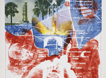
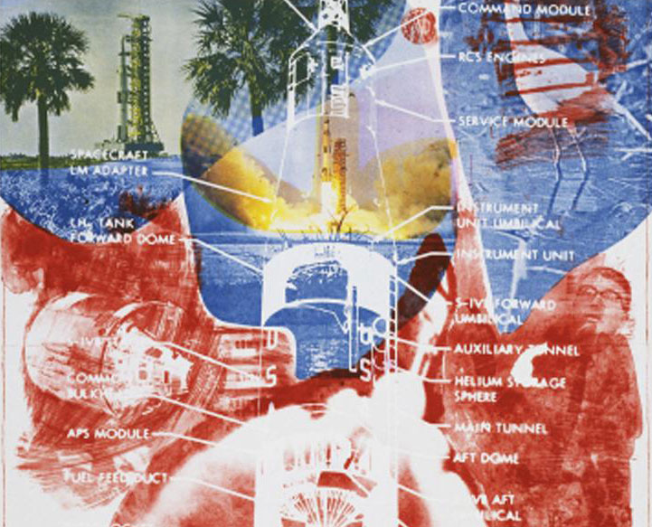
Robert Rauschenberg shook the art world in the 50s and 60s with his flatbed “paintings” on canvas, historically significant in two ways. He disrupted the picture plane by using it as a flatbed on which to overlay objects, and the “source” for the “paintings” was a seemingly disconnected assemblage of appropriated images. Rauschenberg’s paintings, were not paintings at all. These images, incidentally, foreshadowed what was to happen thirty years later when scanners and computers became the “medium” of designers; in fact, they bore a remarkable resemblance to much of late 80s and early 90s design. The “collage,” then, has effectively permeated many aspects of our culture. In the post-modern world, authenticity has been usurped by replication. Sitcoms use the same story lines over and over, as do films. Music and art have been transformed by digital technology. The concept of the avant garde has been replaced by pastiche. We are enmeshed in an exhaustive repetition of images, sounds, and words. A reflexive rather than reflective culture has emerged, and design mirrors that trend in culture. Design is culture, just as marketing is culture. But is that good?
Everyone Can Be an Artist
Traditionally, standards call for art to be beautiful, transcendent, and unique. And despite the cultural changes brought about by computers, many still expect art to be somehow better than real life, and designers and artists to be unique, gifted people. With computers, however, anyone can be a designer, and everyone an artist. Technology is seductive in its promise of egalitarianism and expansion. It provides us with powerful tools, mass communication and changes in transmission and reception. Television and radio are more than entertainment; they’re political tools that utilize a speaker on one end with a subject/listener/recipient on the other. Computers on the other hand, make a two-way exchange possible. This is what makes them so very revolutionary in the evolution of technology.
The Loss of Artistic Authority
The accessibility of the web, its interactivity, and the development of desktop publishing, photo software, and scanners have radically altered design and the way we make images; they challenge our very notions of aesthetics in imaging. While technology democratized access to culture and cultural production itself, as Walter Benjamin said of technical reproduction, it has also unleashed complications in art education and a loss of expertise and “authority” on the part of artists and designers.
André Bazin referred to the photographic image as “a kind of decal or transfer – it is the object itself.” Without creative intervention, he argued, images become reduced to selections or readymades (Brazin, 427). While he wrote this in 1972, one can easily apply this to the readymades of design in the 80s and 90s, such as, photo manipulation in Photoshop and other photo-editing programs. Anyone with access to the equipment can create images. The average person now owns a computer, and home scanners are available for a mere $150. How-to manuals are the rage. And more and more companies have replaced costly skilled designers with unskilled workers for design and layout applications. Where training does occur, it is often in the form of technical, rather than artistic instruction. Weekend software workshops are common, as are the CD-ROM tutorials one buys with the how-to guides.
The Computer-wary
Understandably, there are those who are critical of these trends in design education. Barbara Maria Stafford, speaks in The Art Bulletin of “multimedia technology typically designed by people who possess computer know-how but are not interested in conveying a rich, well-rounded educational experience” and warns that “imagists should be troubled because such rudimentary training by splashy illusionism bypasses the higher-order thought processes imagery is capable of stimulating and mobilizing (Stafford 3).” She also warns of the dangers of alternative “virtual colleges” sprouting up across the country.
Many are skeptical of the computer as a primary learning tool. Writer and educator, Simon Penny, states that “the holistic relationship to the self/mind/body is central to traditional art practice, “and that “computers are promulgating values across culture and snuffing out bodily action.” Cyberculture, on the other hand, is asserting that the body is obsolete and that technology enables the privileging of the mind over the body (Penny 30-31). Still others feel that the computer suppresses one’s mental capacities.
Artist Deborah Haynes is also among the computer-wary. She differentiates between data and ideas and warns of the possibility of sensory overload. “Ideas,” she states, “evolve from the intricate interplay of direct experience, memory, insight, and engagement with the ideas of others.” She suggests that the “saturation of the senses with information and data cauterizes the imagination” and warns artists to be aware of the dangers of data overload and the pleasures of electronic data manipulation (Haynes 10-11).
Digital Friendly
Not everyone is a neo-Luddite, however. Many are happy to embrace the new technology. Computers have cut production and labor costs for many companies, and many designers trained in the traditional hands-on method who have converted to digital are thrilled with the technology. Computers allow one to explore many permutations of a concept with ease. The cut-and-paste properties are a tremendous time-saver. Type and color controls permit easy adjustments to customer designs far more easily than “hand” methods could.
 In typography, font programs such as Fontographer have enabled type designers to design their type more efficiently and market them much faster. Many designers, in fact, have opened their own type “foundries” and are marketing fonts themselves—David Carson, for instance, whose company Garage Fonts, produces subversive typefaces. A number of eccentric font companies have emerged, among them Emigre, Thirstype, and Plazm Fonts. Some designers are selling their own fonts over the web or distributing them as shareware. Since the appearance of font creator softwares, the number of typefaces available has exploded.Currently, there are about 25,000 English fonts available (many more since this article was written). This expansion of the market has driven down the cost of fonts, allowing designers to work with a greater variety of type.
Nihilism and the New Nostalgia
As for applications of these new innovations, design has taken interesting and sometimes bizarre turns. In the 70s and 80s, the punk subculture employed the Xerox machine as the primary source for its graphic art. Cut-out letters, hand-drawn letters, poor quality collages, and image degradation made up the punk graphic vernacular, the degradation and crudeness of the images reflecting the nihilism of the culture.
In the late 80s and early 90s, we saw these early punk “crudities” assimilated into more mainstream graphics. Makers of jeans, shoe companies such as Doc Marten, and other youth directed advertisers have employed punk techniques in design, appropriating and popularizing the once subversive non-design. Font companies are now designing “grunge” fonts that look like dilapidated stamps and type that looks like ia 20th generation Xerox machine copy. The use of Xerox and quasi-Xerox degradation of imaging in design seems almost a kind of nostalgia for an earlier, cruder appropriation/replication device. And computers are already replacing Xerox machines in many ways.
Much of what we now see in design seems like the new nostalgia to me. References to the 60s and 70s, to psychedelia and neo-hippydom are the trend. And even design geared toward a wider audience is pushing the boundaries of acceptability. While “classicists” may decry the blurring of high and low design, others welcome its diversity and accessibility. Accessibility should not be confused with readability, a primary concern of typographers. Accessibility concerns the potential for an image or text to convey something to a culture about a culture, an ability to engage something narcissistic in a culture. Type that passes the limits of readability can also very pictorial and expressive in an abstract way. The graphic treatment of type, while challenging to many viewers, has opened up new poetic possibilities in advertising. And just as the boundaries between fine art and advertising were obscured by painters in the sixties, we now see a blurring in graphics, a phenomenon quite compelling to at least some segments of society.
While many worry about the quality of design in the democratized computer age, we should remember that there have always been extremes in terms of quality. There will always be high and low culture, bad art and art that is sublime. There will also always be a dialogue about it. What is happening now, perhaps, is that the growing participatory public may be less discriminating. However, the demand for designers is growing faster than they can be produced. There will always be conscientious, talented individuals and discerning critics too.
Critics may or may not “like” Picasso, but virtually all recognize that his importance lies in what he made it possible for other artists to do. Similarly, the writing of Charles Bukowski aestheticized the crude but provided an extreme that opened up new possibilities for writing. Carson does the same for design, in terms of pushing limits. Does he go overboard? Maybe sometimes. Is it always good? Probably not. But he certainly provides a point of comparison and of departure for other designers.
 One art historian addressed the question of “What is art?” in a simple but interesting way. “Everything is art,” he said. “But is it good art?” In the computer age, we need to keep this question in mind. The problems of education will, with time, be ironed out. It is all still really quite new. While digitization has resulted in a tactile loss, much of the design that has come about as a result of computers is very compelling. The geometry that has resulted from programs like Illustrator, though neo-Bahausian, is often quite arresting. In twenty years students may not remember the physical origins of the cut-and-paste commands, but this may matter less as the memory erodes. With computers, our very language is changing; so is our cognition, and this is only the very beginning. Like it or not, computers are here to stay. Design is changing. Education is changing. And there’s no choice, really, but to hop on the train, or be left behind.
Works Cited
Benjamin, Walter. “The work of Art in the Age of Mechanical Reproduction,” Illuminations. Schoken Books, 1955.
Brazin, Andre’. “The Ontology of the Photographic Image in Modern Culture and the Arts,” Modern Culture and the Arts. eds. James B. Hill, Barry Ulanove (McGraw-Hill: New York, 1972).
Haynes, Deborah. “The Techno-Seduction of the Artist,” Art Journal, 56, 1, Spring 1997, 10-11.
Meggs, Phillips. The History of Graphic Design. (Van Nostrand Reinhold, 2nd edition, 1996).
Penny, Simon. “The Virtualization of Art Practice: Body Knowledge and the Engineering Worldview,” Art Journal 56, 3, Fall 1997, p.30-31.
Stafford, Barbara. “Educating Digerati,” Art Bulletin, June 1997, abstract reprinted from Internet, p. 3.
Ulmer, Gregory. “The Object of Post Criticism.” The Anti-Aesthetic. Ed. Hal Foster. Bay Press, 1983. 88-90.
Bibliography
Benjamin, Walter. “The work of Art in the Age of Mechanical Reproduction,” Illuminations. Schoken Books, 1955.
Black, Alison. “IDJ Papers: From Desktop Publishing to Computer Assisted Typography.” Paper presented at the Design Council Conference: Computers and Design Education, Regent’s College, 2 June 1988. Internet document.
Blackwell, Lewis and Carson. David. The End of Print. (Chronical Books, 1995).
Brazin, Andre’. “The Ontology of the Photographic Image in Modern Culture and the Arts,” Modern Culture and the Arts. eds. James B. Hill, Barry Ulanove (McGraw-Hill: New York, 1972).
Benjamin, Walter. “The work of Art in the Age of Mechanical Reproduction,” Illuminations. 1955.
Buck-Morss, Susan. “Aesthetics and Anaesthetics: Walter Benjamins Artwork Essay Reconsidered,” Art Journal, 56, 1, Spring 1997.
Craig, James. Designing with Type. (Watson-Guptill, 3rd ed., 1992).
Harper, Laurel. “Beyond the End of Print: A Conversation With David Carson,” How, February, 1998.
Haynes, Deborah. “Techno-Seduction of the Artist,” Art Journal, vol. 56, no. 1, Spring 1997.
Heller, Steven and Fink, Anne. Faces on the Edge: Type in the Digital Age. (Van Nostrand Reinhold, 1997).
Macko, Nancy. “A View of the Intersection of Art and Technology,” The Art Bulletin, June, 1997.
Megs, Phillips. The History of Graphic Design. (Van Nostrand Reinhold, 2nd edition, 1996).
Parramón, José. Lettering and Logotypes. (Watson-Guptill, 1991).
Penny, Simon. “The Virtualization of Art Practice: Body Knowledge and the Engineering Worldview,” Art Journal vol. 56, no. 3, Fall 1997.
Plagens, Peter and Sawhill, Ray. “Throw Out the Brushes: Commercial Artists Are Going Digital,” Newsweek, vol.30, no.9, p.75.
Sasson, Rosemary. Computers and Typography. (Intellect
Press, 1993).
Stafford, Barbara. “Educating Digerati,” Art Bulletin, June 1997, abstract reprinted from Internet.
Ulmer, Gregory. “The Object of Post Criticism.” The Anti-Aesthetic. Ed. Hal Foster. Bay Press, 1983.
You must be logged in to post a comment.